What you’ll learn
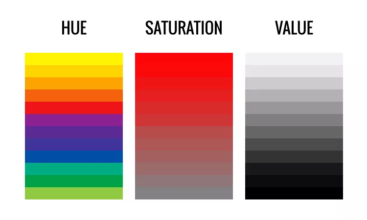
You’ll quickly identify hue (the color family), value (light vs dark), and saturation (intensity), then combine them into 2–4 color palettes that read clearly and support mood and focus.
Key terms
- Hue: The color family (red, blue, green…).
- Value: How light or dark a color is. Value carries the read.
- Saturation: How intense or muted a color is.
- Temperature: Warm vs cool versions inside a hue (e.g., warm red vs cool red).
- Chroma shift: Changing saturation while keeping value similar.
Simple harmony schemes
- Monochrome: One hue, multiple values/saturations. Clean and focused.
- Analogous: 2–3 neighbors on the wheel. Smooth, natural mood.
- Complementary: Opposites on the wheel. High contrast—use one as accent.
- Split-Complementary: Hue + the two neighbors of its complement. Flexible drama.
Value-first thinking
- Pick a clear light, mid, and dark. Let the value do the composition work.
- Use saturation strategically: most areas slightly muted; small accents saturated.
- Limit palette to 2–4 paints/inks/markers to avoid mud.
Build a 3–4 color palette
1
Choose a base hue
Pick the mood driver (e.g., calm blue, energetic orange). Note whether you want it warm or cool.
2
Select a partner
Analogous for harmony, complementary for pop, or split-comp for balance. Keep it simple—one partner is enough.
3
Define values
Assign roles: one light, one mid, one dark. Sketch a tiny value map for your piece (3 boxes is fine).
4
Tune saturation
Mute large areas slightly; reserve the most saturated color for small focal accents or edges.
5
Make a swatch card
Create 6–8 swatches with notes (hue, value, saturation). Keep this card near your canvas/sketchbook.
Tips
- Value hierarchy first; color second. Squint test your piece often.
- Put the brightest color on/near the focal point, not everywhere.
- For skin tones: start neutral (desaturated), then glaze subtle warms/cools.
Troubleshooting
- Muddy colors: Too many paints mixed—limit to 2–3 at once.
- Flat look: No clear value plan—re-map light/mid/dark first.
- Over-saturated: Knock back large areas; keep the pop for small accents.